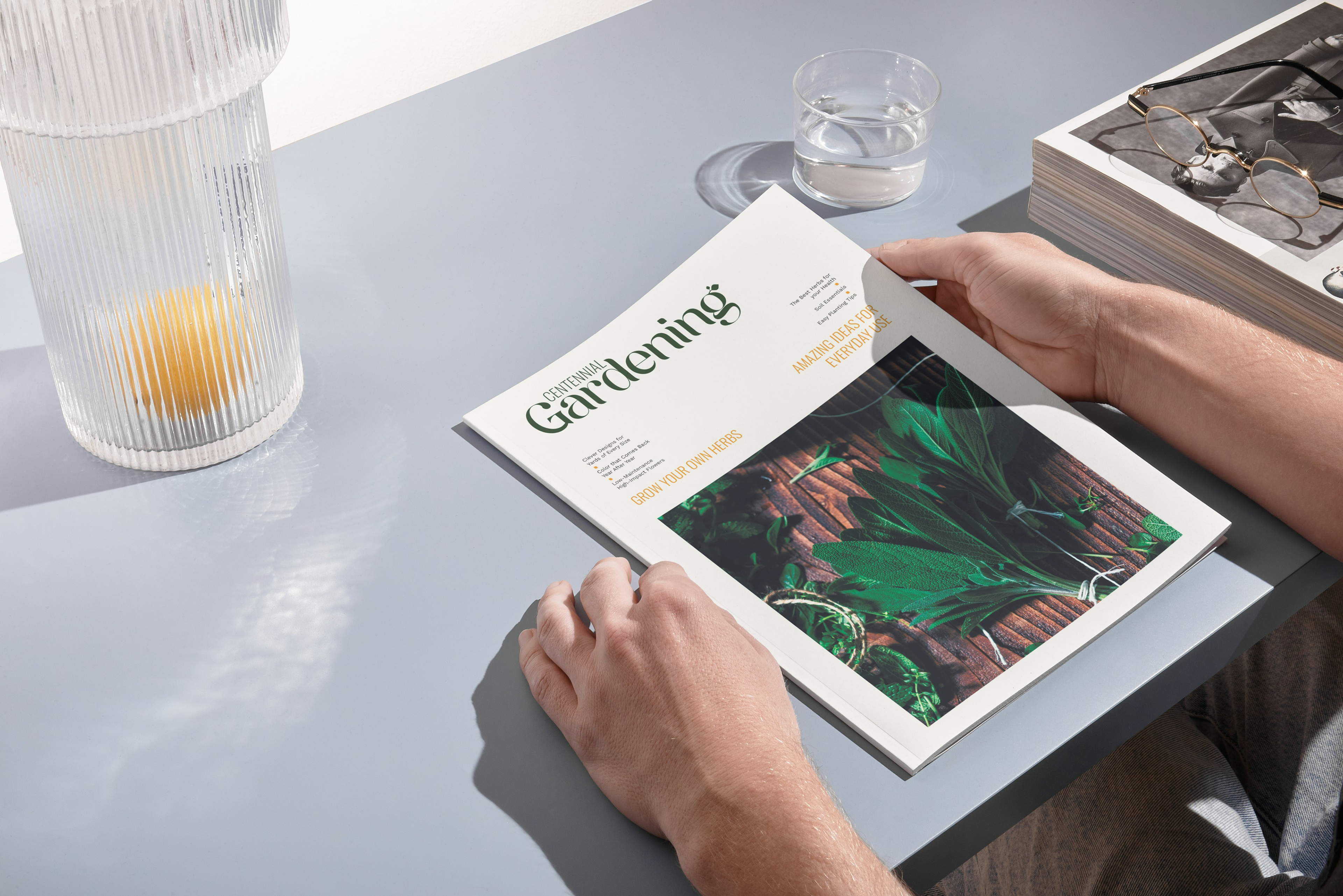
The redesign of Centennial Gardening magazine was aimed at refreshing its outdated appearance and enhancing its overall readability. The original version featured a low-contrast color palette that made the magazine feel dated and visually unappealing. In addition, the layout was disorganized, and the design lacked the modern, clean look that readers expect from a current, professional publication.
To address these issues, I implemented a bold, high-contrast color scheme that not only improves visual appeal but also makes the content stand out more effectively. I streamlined the article titles, making them more concise and engaging to draw readers in immediately. To further improve readability, I restructured the layout and flow of the articles, ensuring that the content was easier to follow and more enjoyable to read. By organizing the pages more effectively and removing unnecessary clutter, I was able to create a cleaner, more modern feel for the magazine.
Overall, the redesign of Centennial Gardening gives the magazine a much more contemporary, user-friendly aesthetic. The changes were made with the goal of attracting new readers while also enhancing the experience for long-time subscribers, ensuring the publication remains relevant and visually appealing in an increasingly design-conscious market.
*Mock Project