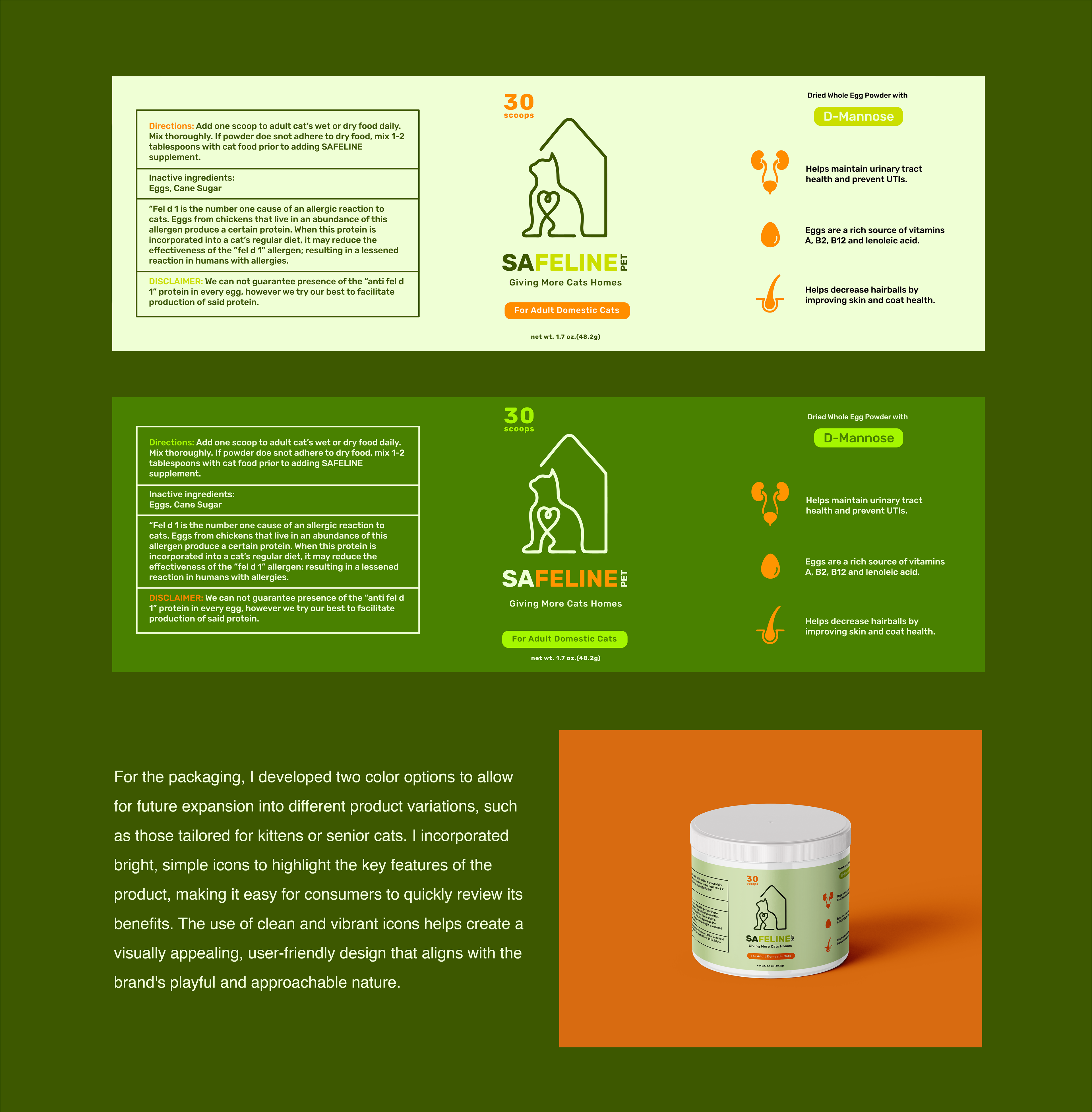
Safeline Pet was established with the core mission of reducing pet allergens, ultimately helping more cats find homes. As a long-time user and supporter of the product, I recognized its potential and felt a strong connection to its purpose. Motivated by this, I took the initiative to rebrand the company, aiming to broaden its reach and engage a larger audience. My goal is not only to amplify awareness of the product’s benefits but also to communicate the heart and soul of the brand, highlighting its commitment to both pets and their owners. Through this rebrand, I hope to elevate the brand's presence and make it more accessible to those who could benefit from it.
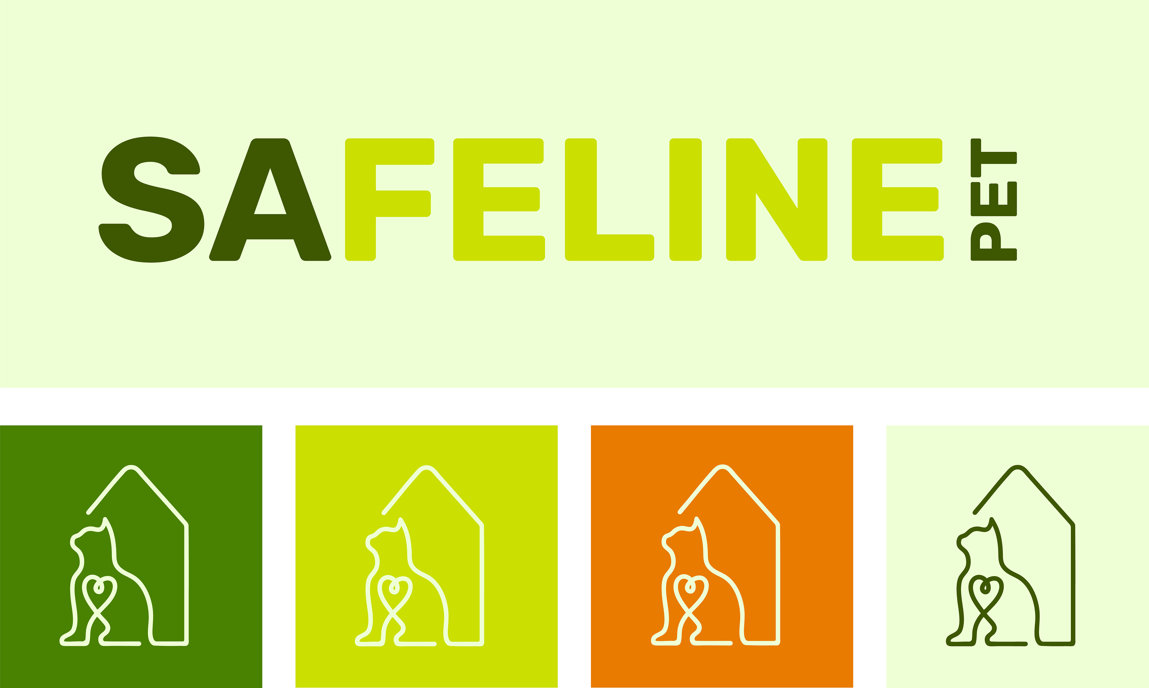
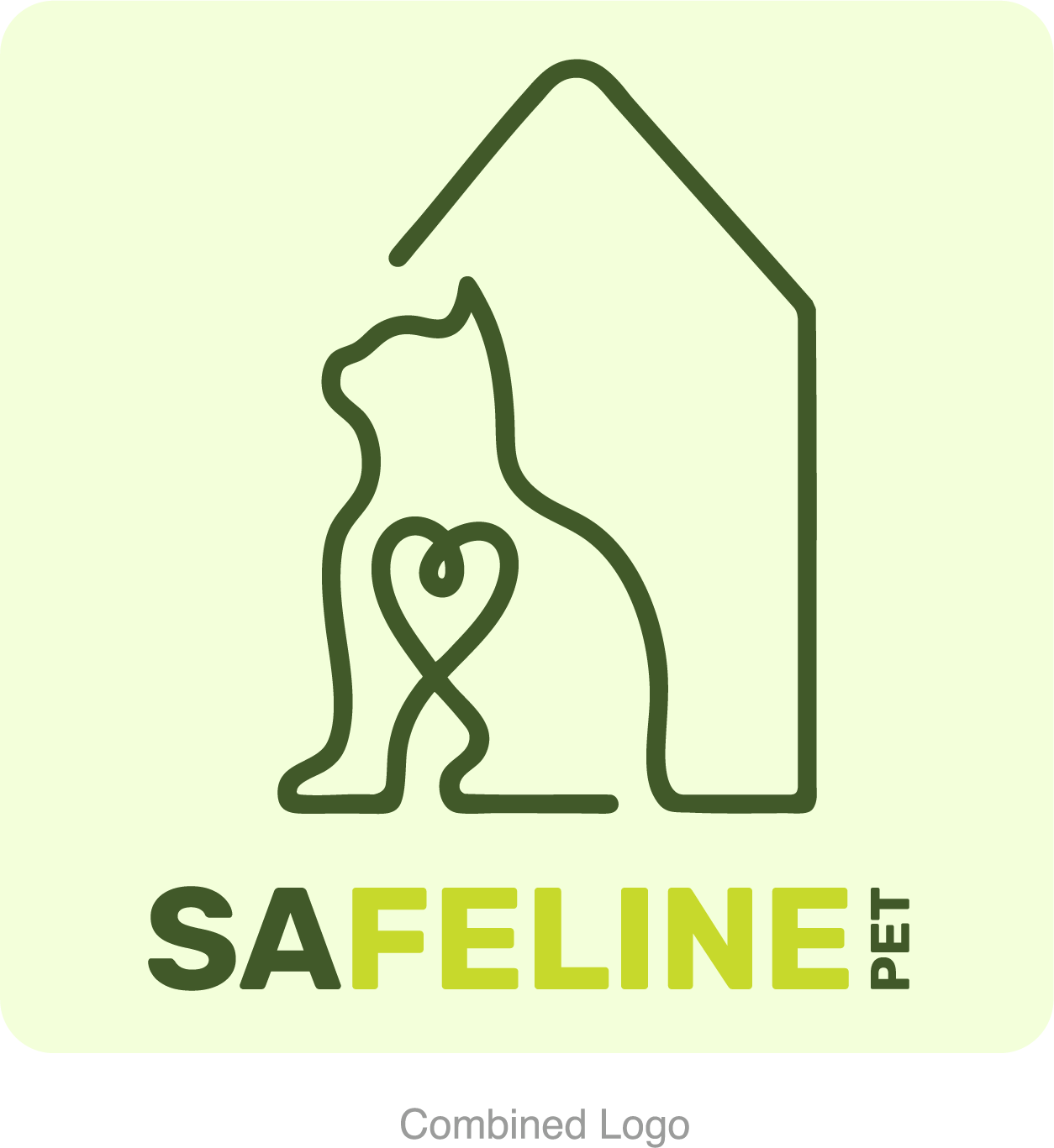
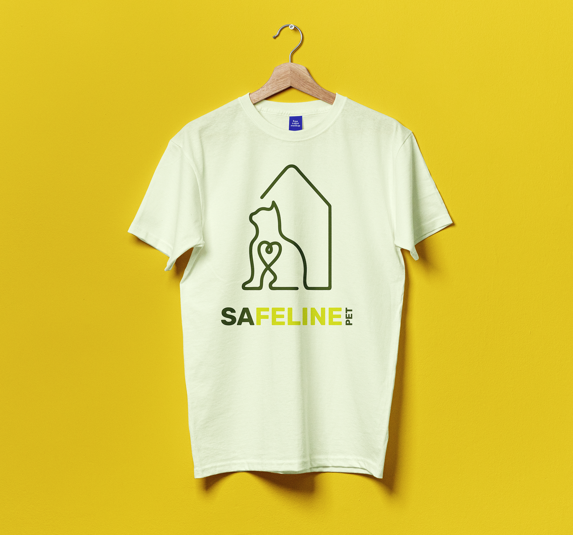
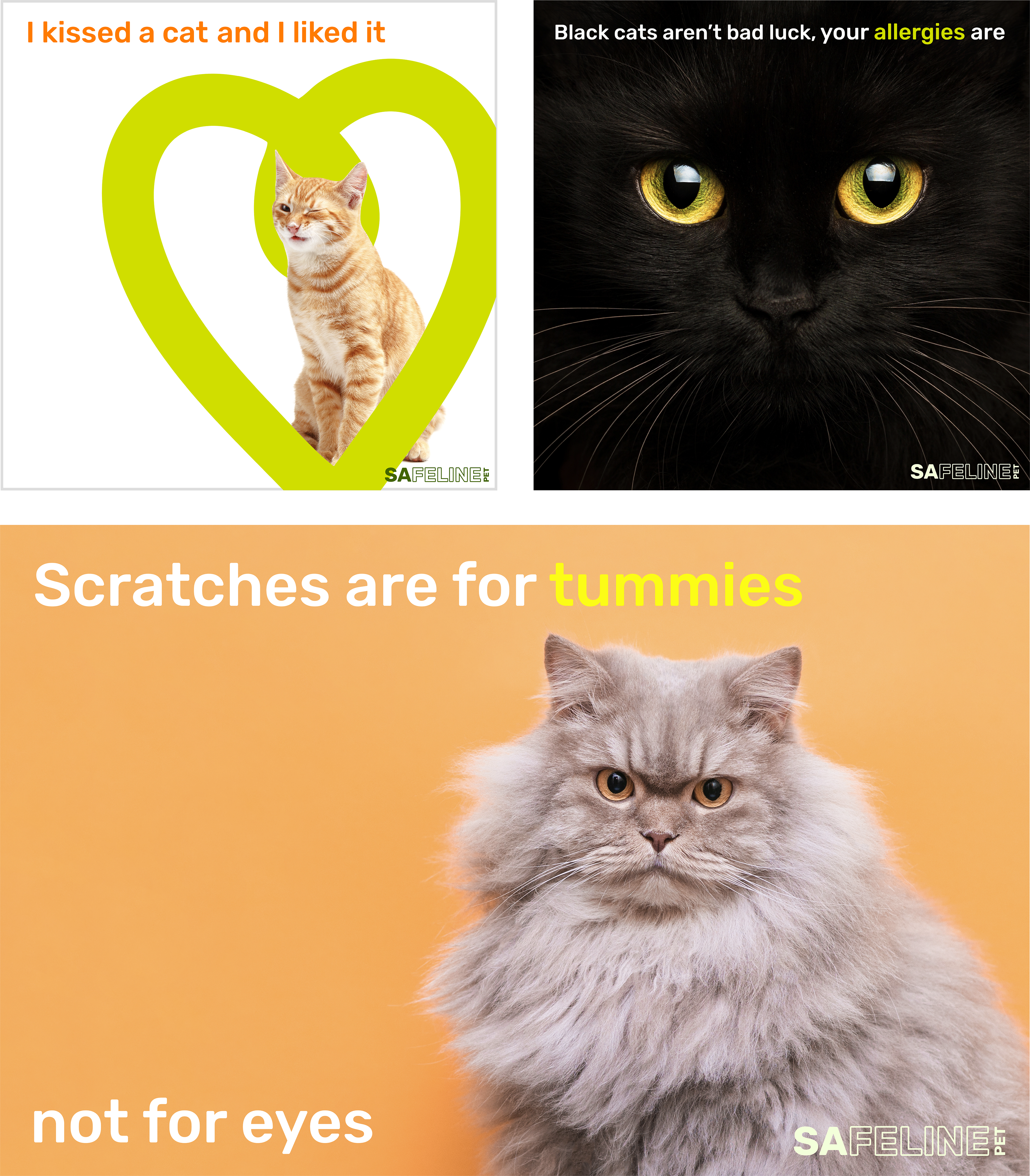
When creating the wordmark for Safeline Pet, I aimed to retain the core essence of the original logo by emphasizing "Feline" in the design. However, I chose brighter colors and a typeface with softer edges to create a more approachable, playful feel. This approach helps convey the brand's friendly and welcoming nature.
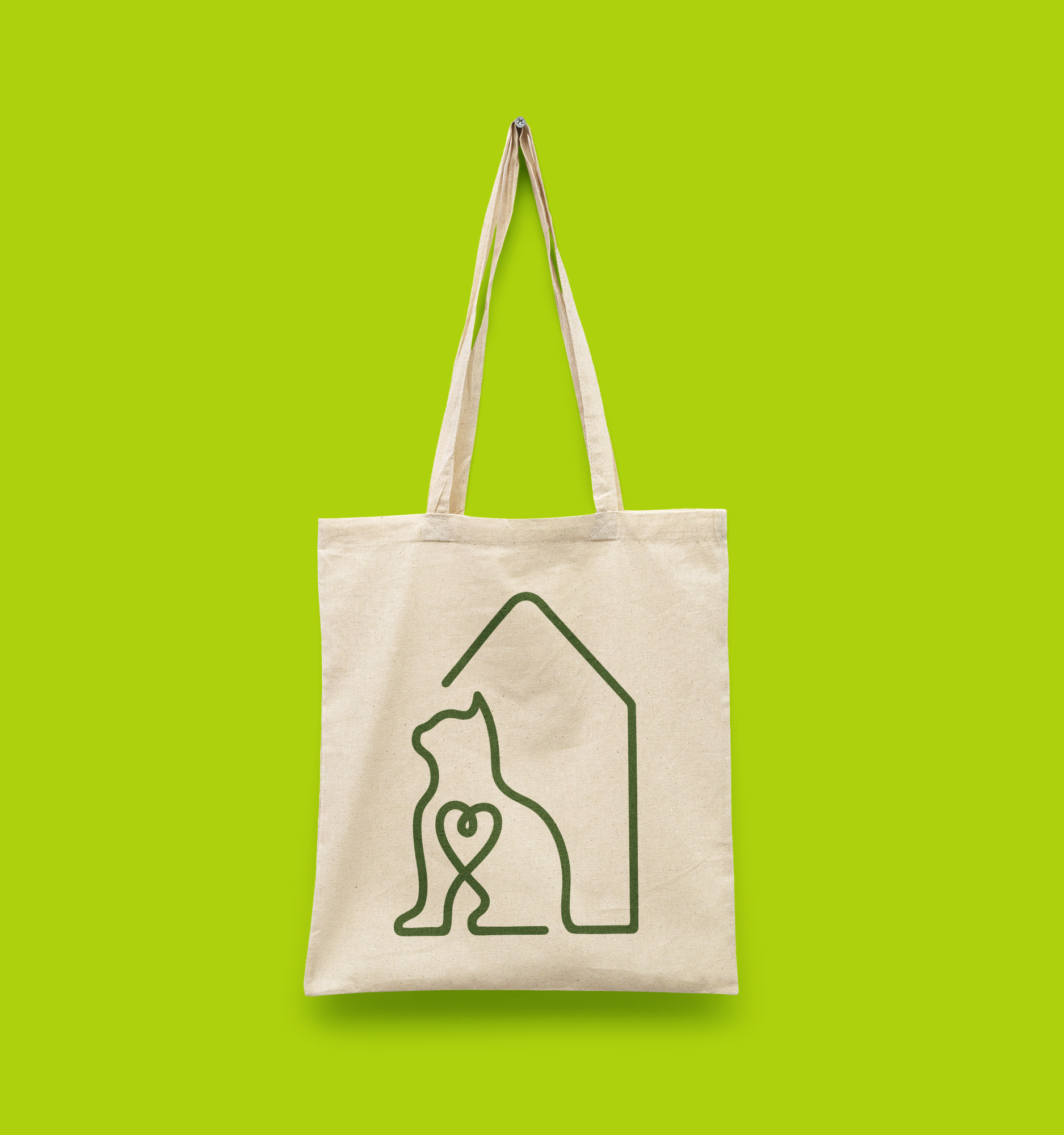
I redesigned the logo into a simplified version of the original, taking out any unnecessary and distracting elements and leaving the core. This ensures that the brand is easily recognizable and understood, even without context, while also providing greater flexibility for advertising. Additionally, I created multiple color variations to suit different backgrounds and add variety.